Visualization
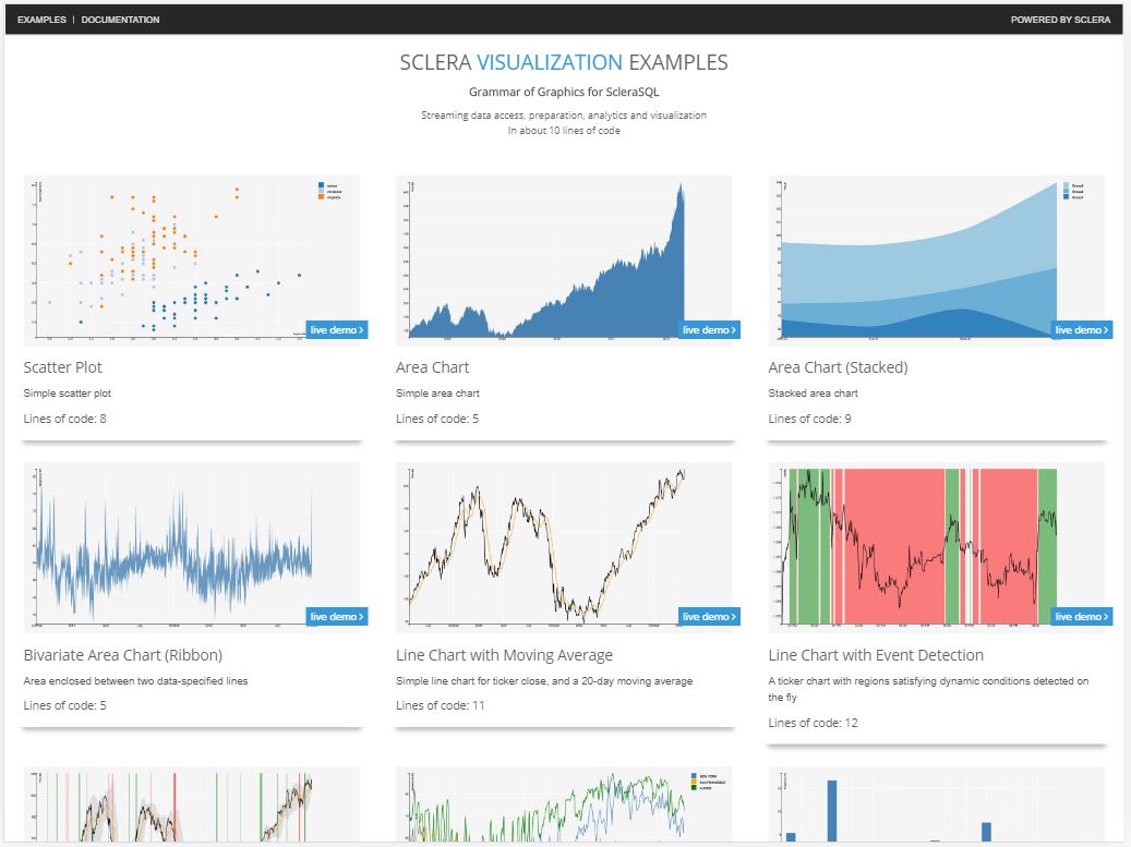
Sclera's visualization component, ScleraViz, enables quick and easy visualization of your query results. ScleraViz is integrated with ScleraSQL; this means a few lines of ScleraSQL can fetch, clean, analyze and visualize your data in a single sweep.
ScleraViz is inspired by Grammar of Graphics, specifically R's ggplot2 -- but is implemented as an extension to ScleraSQL and uses D3 as the rendering engine. Moreover, unlike ggplot2, ScleraViz can clean, analyze and plot streaming data.
An online preview, with a number of examples with code, is available at https://scleraviz.herokuapp.com.
In this document, we first describe how to set up Sclera to use ScleraViz, then illustrate ScleraViz by example, and finally give the detailed syntax of ScleraSQL visualization queries.
Command Line Setup◄
In the following, <sclera-root> is the directory where Sclera is (or, is to be) installed.
To run ScleraViz queries, you need to:
-
Install Sclera Command Line using
scleradmin(detailed instructions here)$ scleradmin --install --root <sclera-root> -
Install the Sclera Web Display plugin
$ scleradmin --add sclera-plugin-webdisplay --root <sclera-root> -
If you need to read CSV data, install the CSV plugin as well
$ scleradmin --add sclera-plugin-csv --root <sclera-root> -
Start the Sclera Command Line Shell
$ <sclera-root>/bin/sclera Welcome to Sclera 4.0 > _ -
In the Sclera Command Line Shell, start the display web server:
Welcome to Sclera 4.0

> display start;
HTTP server started at port 7070
Please point your browser to http://localhost:7070
To start the server at a port other than 7070, you need to specify the port number explicitly at the end. For example,
display start 8080;starts the server atlocalhost:8080. -
Start a web browser and open the URL http://localhost:7070
Running a ScleraViz query (described in the rest of this document) on the Sclera Command Line will display the visualization in the browser. In addition, to display the contents of a query as a table in the browser, you can say:
> display <query>;
For example, the following displays the result as a two column, single row table in the browser:
> display select 'Hello' as greeting1, 'World' as greeting2;
Leaving the keyword display out displays the result in the command line shell, as usual.
You can also display arbitrary text (say, comments) as well:
> display "The plot above is amazing!";
When done, you can close the display web server by saying:
> display stop;
ScleraViz by Example◄
This section very briefly introduces the rudiments of the plot specification. This is to quickly get you started on plotting your own graphs. A complete and formal description of the syntax appear in the next section.
Example Dataset
In the following, we will be using the "tipping" dataset as our running example. The data set contains information about tips received by a waiter in a restaurant over a period of time. The information includes the tip in dollars, total bill in dollars, gender of the bill payer, whether there were smokers in the party, day of the week, time of day, and size of the party. Further details on the data can be found here.
To use the dataset, set up the tips table as follows:
CREATE TEMP TABLE tips as
EXTERNAL CSV("http://scleraviz.herokuapp.com/assets/data/tips.csv")
TYPEINFER(LIMIT 1);
Notation: In the above and the following examples, the ScleraSQL keywords will be capitalized. This is for illustrative reasons only; ScleraSQL is case-insensitive.
A Simple Plot◄
Putting a PLOT afer the query plots the column y in the query result against the column x in the query result as a scatter plot. So, to plot the tip against the total_bill in the tipping dataset, we say:
SELECT total_bill as x, tip AS y FROM tips
PLOT;
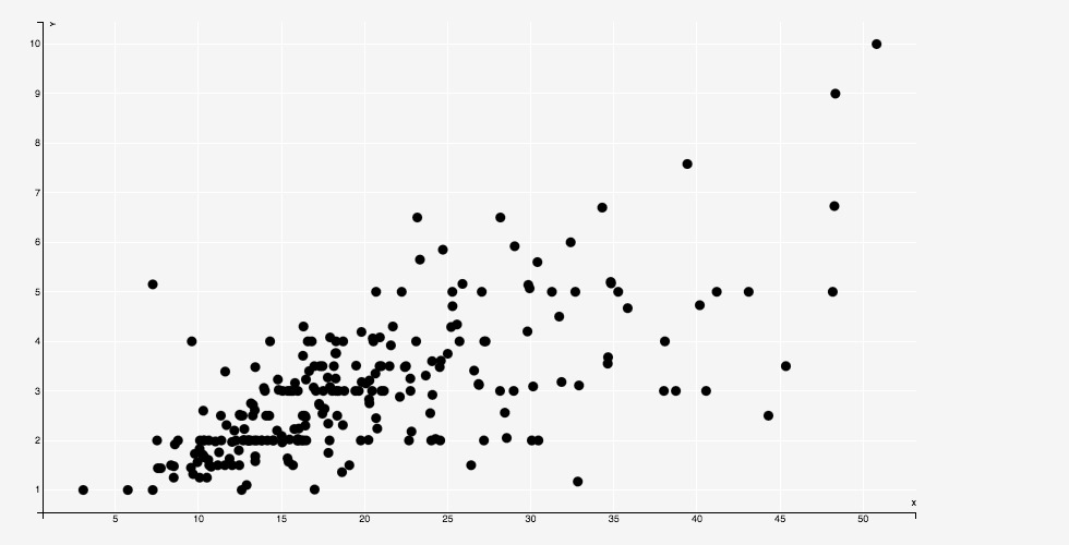
The above statement works on a bunch of defaults -- it creates a scatter-plot, which takes column x in the input as the default for the X coordinate, and column y in the input as the default for the y coordinate, and also takes default values for aesthetics such as point fill and stroke color, size, opacity (alpha), etc.
In the discussion that follows, we show how to explicitly override these defaults, and even vary them as a function of the data.
Specifying the Geometry◄
A "geometry" refers to the manner in which a data point maps to the chart. In the scatterplot example above, the geometry is a POINT.
We can explicitly specify the geometry as follows:
SELECT total_bill as x, tip AS y FROM tips
PLOT(GEOM=POINT)
The location of a geometry is determined by a set of parameters. By default, these parameters are mapped to appropriately named columns in the input. For instance, each point above is placed according to the values in the x and y columns.
We can override this default by explicitly specifing custom columns for these parameters. So, another way to write the example above is:
tips PLOT(GEOM=POINT(x=total_bill, y=tip))
Here, the parameters x and y are mapped to input columns total_bill and tip respectively; in general, they can be mapped to arbitrary expressions.
Sclera supports a number of alternative geometries.
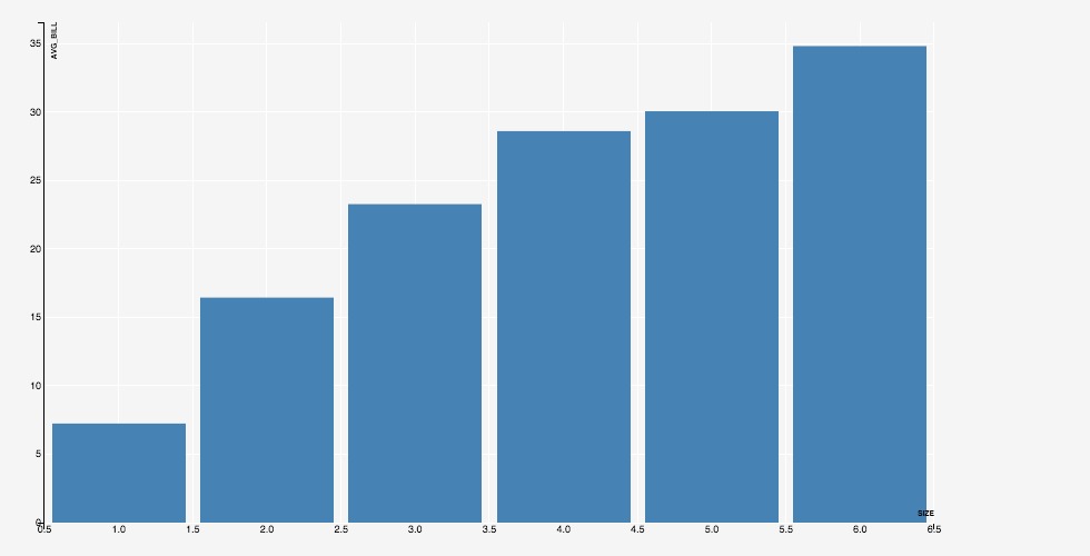
For instance, to plot the average bill for a given party size against the party size as a histogram, we can say:
SELECT `size`, AVG(total_bill) as avg_bill
FROM tips
GROUP BY `size`
PLOT(GEOM=BAR(x=`size`, y=avg_bill))
size needs to be in backquotes as it is a keyword. This is a parser requirement; we understand that it is cumbersome and are working on workarounds. Meanwhile, it is always a good idea to put the column names in backquotes.)
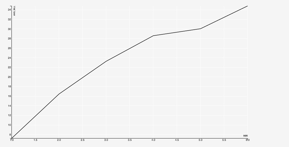
Similarly, to plot the same data as a line, we use GEOM=LINE:
SELECT `size`, AVG(total_bill) as avg_bill
FROM tips
GROUP BY `size`
PLOT(GEOM=LINE(x=`size`, y=avg_bill))
A full list of the supported geometries appears as a part of the detailed documentation.
Aesthetics and Legends◄
The aesthetics parameters specify the "look and feel" of a chart. For a scatterplot, for instance, the parameters specify the shape of the point (circle, square, triangle, and so on), the color to be used to fill the point, the color used for the boundary, and so on.
The set of aesthetics parameters varies with the geometry. For example, a SHAPE makes sense for a point, but does not make sense for a line. The list of aesthetics parameters associated with respective geometries appears as a part of the detailed documentation.
An aesthetics parameter can either be a constant, or an expression. If the parameter is a constant, e.g. FILL="black", then the value of the aesthetics is literally taken as the constant. If the parameter is an expression, then distinct values of the columns are mapped to distinct values of the aesthetic.
For instance, if we specify FILL=foo where foo is an input column, then by default, each distinct value of foo is mapped to a distinct value of the color that is actually used for the fill. The mapping from each distict value of the column foo to the corresponding color is automatically maintained, and can be output as a legend, by saying FILL=foo LEGEND.
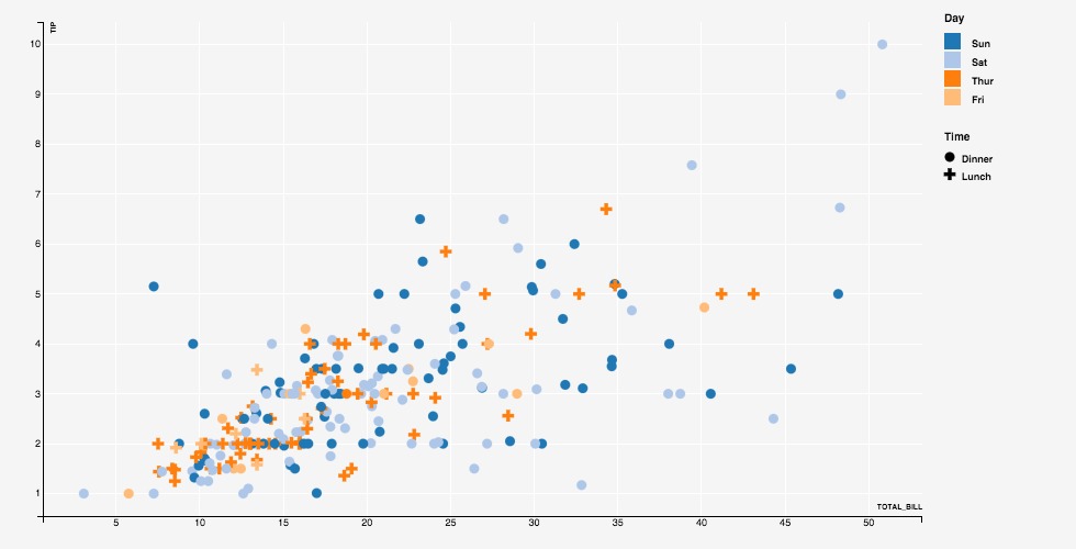
The following example shows a scatterplot with expressions for FILL and SHAPE aesthetics.
tips PLOT(
  GEOM=POINT(x=total_bill, y=tip),
  FILL=day LEGEND(TITLE="Day"),
  SHAPE=`time` LEGEND(TITLE="Time")
)
A full description of the aesthetics parameters appears in the detailed documentation.
Group◄
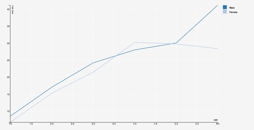
The optional GROUP directive specifies an expression on the input data. The input data points are first partitioned based on the values of this expression (similar to the SQL GROUP BY), and each partition is plotted separately in the same layer.
For instance, adding a GROUP directive to a LINE will plot a line for each distinct value of the GROUP expression.
SELECT `size`, gender, AVG(total_bill) as avg_bill
FROM tips
GROUP BY `size`, gender
ORDER BY `size`
PLOT(GEOM=LINE(x=`size`, y=avg_bill), GROUP=gender, STROKE=gender LEGEND)
Key◄
By default, each row in the input corresponds to a unique data point. The optional KEY directive enables associating multiple rows with the same data point -- successive rows with the same key value render as the same data point, overriding the previous rendering.
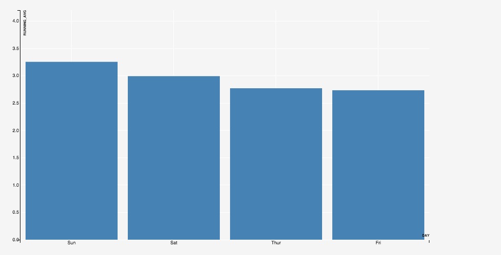
This is helpful to display, say, a dynamic bar chart showing a running average for tips collected on each day of week. We specify KEY=day and, for every input row, generate a row containing the updated running average of tip for the associated value of day.
With KEY=day, the first rows for a value create a bar, and the subsequent roes for the same value update the existing bar.
SELECT day, T.avg(tip) as running_avg
FROM tips T PARTITION BY day
PLOT(GEOM=BAR(x=day, y=running_avg), KEY=day)
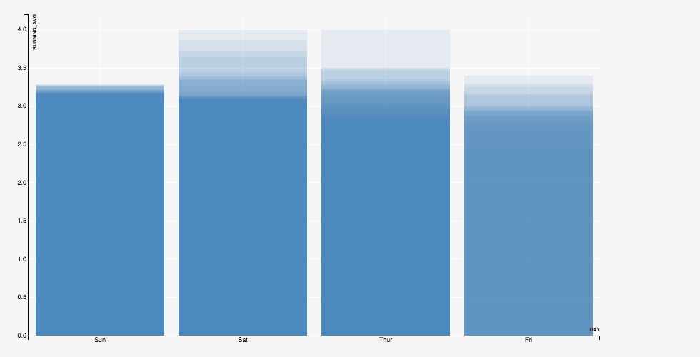
Without KEY=day, a new bar will be generated for each update.
SELECT day, T.avg(tip) as running_avg
FROM tips T PARTITION BY day
PLOT(GEOM=BAR(x=day, y=running_avg), ALPHA=0.1)
Position Adjustments◄
Following the grammar of graphics philosophy, the input data is assumed to have one row per data point. When two data points are rendered one over the other, they are said to "collide".
Colliding data points can be repositioned by specifying a POSITION directive, which can take values dodge, stack, or jitter.
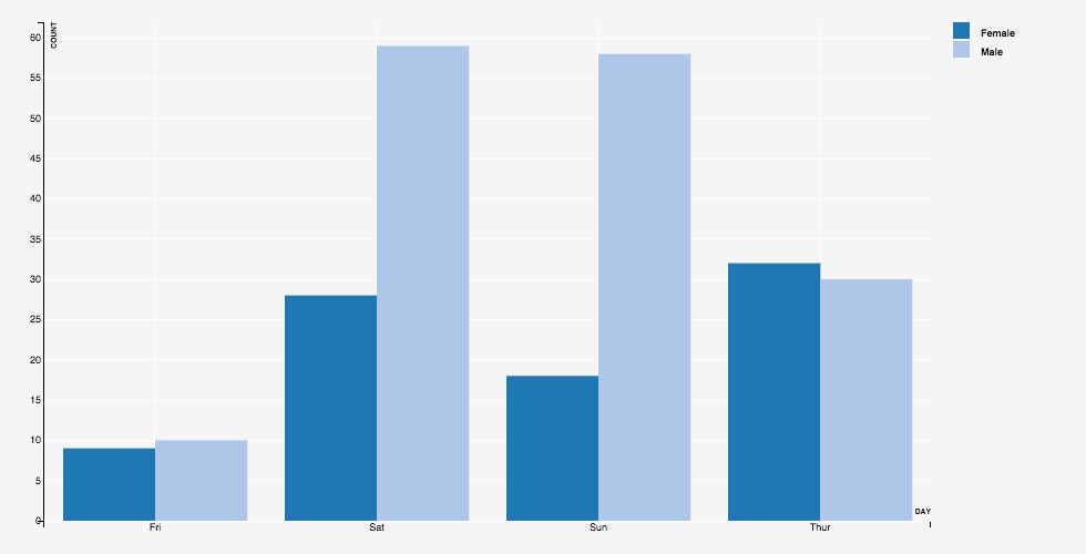
Specifying POSITION=DODGE positions the data points in a row, one after other, around the common x position on the X axis. When the geometry is BAR, this gives the familiar "grouped" bar chart:
SELECT day, gender, count(*) AS count
FROM tips
GROUP BY day, gender
ORDER BY day, gender
PLOT(GEOM=BAR(x=day, y=count), POSITION=DODGE, FILL=gender LEGEND)
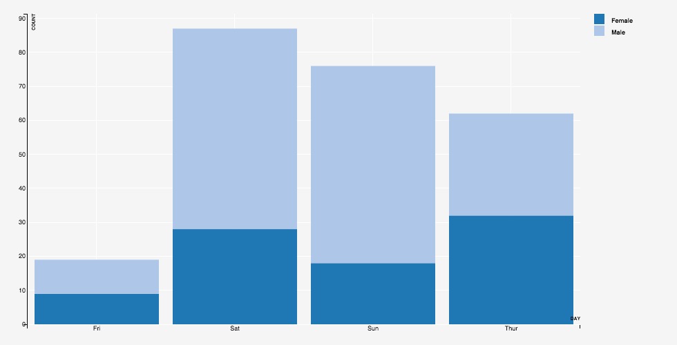
Specifying POSITION=STACK positions the data points in a column, one over other, at the common x position on the X axis. When the geometry is BAR, this gives the familiar "stacked" bar chart:
SELECT day, gender, count(*) AS count
FROM tips
GROUP BY day, gender
ORDER BY day, gender
PLOT(GEOM=BAR(x=day, y=count), POSITION=STACK, FILL=gender LEGEND)
Specifying POSITION=jitter adds a random offset to both the x and y positions of the data point. This is useful when we have overlapping points, so that the top points obscure the ones below -- the jitter randomly scatters the obscured points within a small ball around their position, making them visible.
Stat◄
The STAT directive specifies a statistical operation over the input data points. Supported operations include computing local regression smoothing, computing density histograms, and computing heat-maps.
By default, the results are computation are overlayed over the base plot.
For instance, consider the scatter-plot of average tips against the total bill. Including STAT=loess plots a line representing local regression smoothing over these data points. This curve brings out the trend in the data -- how the tips vary with increasing total_bill -- that may not be apparent from just the scatter plot.
SELECT total_bill, avg(tip) as avg_tip
FROM tips
GROUP BY total_bill
PLOT(
  GEOM=POINT(x=total_bill, y=avg_tip),
  STAT=LOESS(STROKE="orange", STROKE_WIDTH="5px")
)
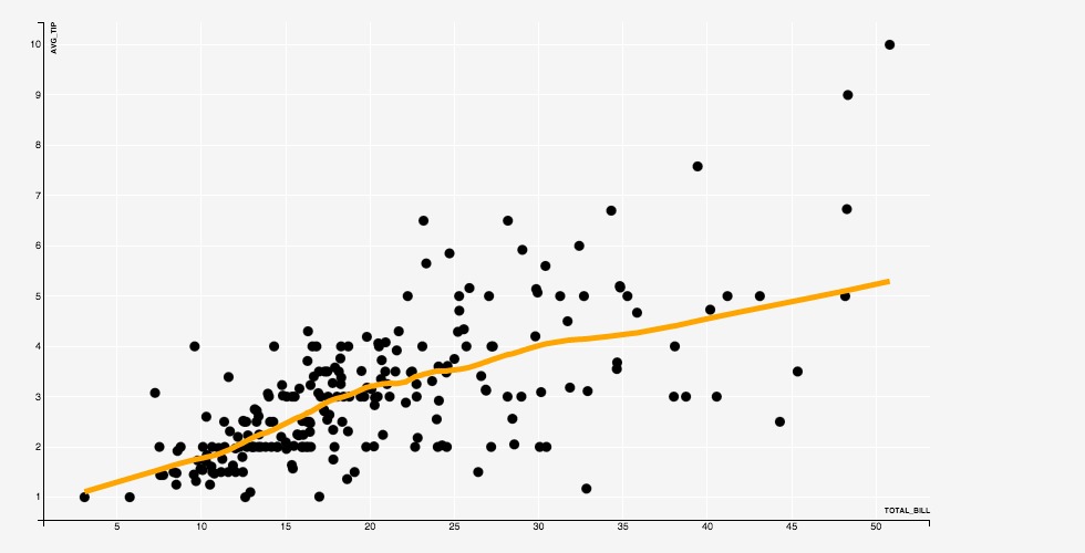
The computed result is plotted in its own layer (see the next section), using a geometry that is determined by the operation, and using aesthetic parameters that can be provided along with the operation, as in the example above.
Mark◄
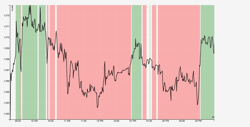
The MARK directive marks out regions where a specified predicate is true. This is done in real time, as the data arrives, and so can be very useful in monitoring for events.
For example, the following query marks regions in a stock ticker where the current high is greater than the running average high with green, and regions where the current low is less than the running average low with red.
EXTERNAL CSV("http://scleraviz.herokuapp.com/assets/data/infy.csv") TYPEINFER(LIMIT 1) AS infy
PLOT(
  GEOM=LINE(x=ts, y=close),
  MARK XAXIS(
    high > infy.AVG(high),
    FILL="green"
  ),
  MARK XAXIS(
    low < infy.AVG(low),
    FILL="red"
  )
)
Multi-Layered Plots◄
A layer represents a unit of rendering in the plot. The examples so far, except the stats, included a single layer -- which is the default.
A layer can only support one kind of geometry, and the associated set of aesthetic parameters and position specifications. If you want to include, say, a scatter plot and a line in the same plot, you need to have separate layers for the points and the line.
You can explicitly specify layers using the LAYER keyword. The initial scatterplot can be equivalently be specified as:
tips PLOT(LAYER(GEOM=point(x=total_bill, y=tip)))
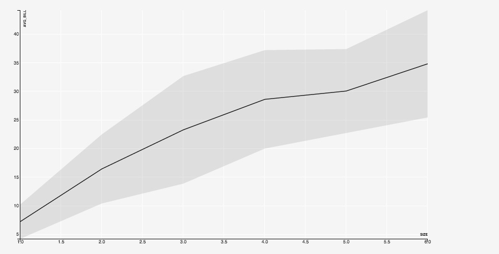
We can specify multiple layers in the same plot. The following plots the average bill for a party size, along with a one-standard deviation interval in a separate layer:
SELECT `size`, avg(total_bill) as avg_bill, stddev(total_bill) as sdev
FROM tips
GROUP BY `size`
ORDER BY `size`
PLOT(
  LAYER(GEOM=LINE(x=`size`, y=avg_bill)),
  LAYER(GEOM=RIBBON(x=`size`, ymin=avg_bill - sdev, ymax=avg_bill + sdev))
)
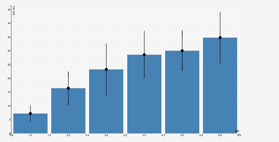
Another example on the same query, this time with bars and error lines:
SELECT `size`, avg(total_bill) as avg_bill, stddev(total_bill) as sdev
FROM tips
GROUP BY `size`
ORDER BY `size`
PLOT(
  LAYER(GEOM=BAR(x=`size`, y=avg_bill)),
  LAYER(
    GEOM=POINTRANGEY(
      x=`size`, y=avg_bill,
      ymin=avg_bill - sdev, ymax=avg_bill + sdev
    )
  )
)
The STAT directive mentioned in the previous section implicitly adds a new layer to the plot, with the result of the associated operation.
Multi-Plots◄
We can have multiple plots on the same input data; these plots are plotted simultaneously in a single scan of the input.
For instance, the following specification renders two separate plots on the same input:
tips
PLOT(GEOM=POINT(x=total_bill, y=tip), ALPHA=0.3)
PLOT(GEOM=POINT(x=`size`, y=tip), ALPHA=0.3)
PLOT(GEOM=POINT(x=`size`, y=total_bill), ALPHA=0.3)
PLOT(GEOM=POINT(x=total_bill, y=total_bill), ALPHA=0.3)
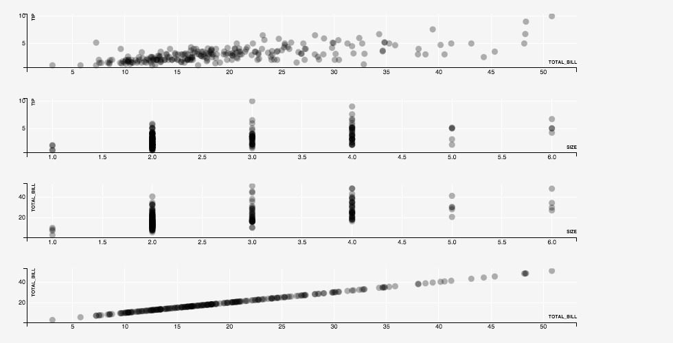
The plots are plotted one after the other, in separate rows. As the plots are rendered, the Y-axes of the first two plots, which plot the same column tip, and the X-axes of the last two plots, which plot the same column size are kept synchronized.
Automatic Layouts◄
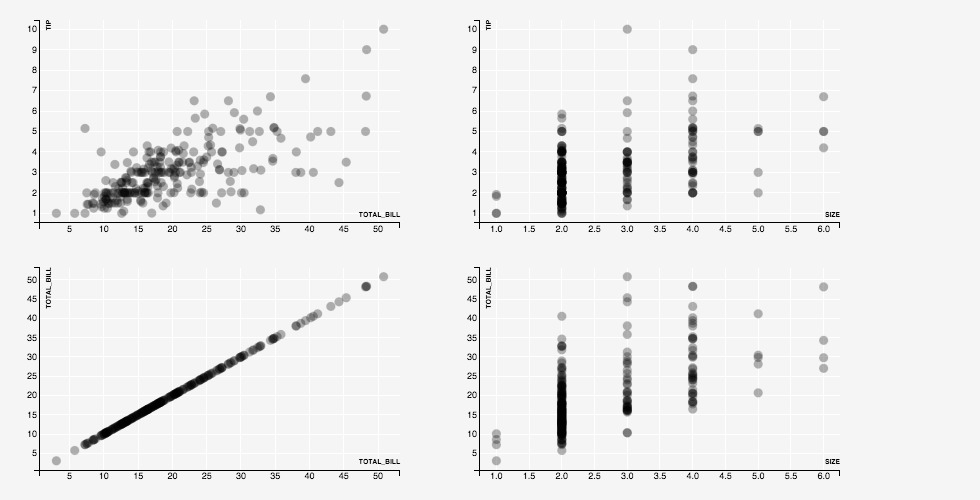
ScalerViz provides an aligned layout mode that places the plots so that plots sharing the same X-axis columns are aligned vertically, and the plots sharing the same Y-axis columns are aligned horizontally. We try this mode, activated using the LAYOUT ALIGNED directive on the example above, to get:
tips
PLOT(GEOM=POINT(x=total_bill, y=tip), ALPHA=0.3)
PLOT(GEOM=POINT(x=`size`, y=tip), ALPHA=0.3)
PLOT(GEOM=POINT(x=`size`, y=total_bill), ALPHA=0.3)
PLOT(GEOM=POINT(x=total_bill, y=total_bill), ALPHA=0.3)
LAYOUT ALIGNED
Weighted Axes◄
In the multi-plot examples above, all axes have the same size. However, we may sometimes want to emphasize some columns over the others.
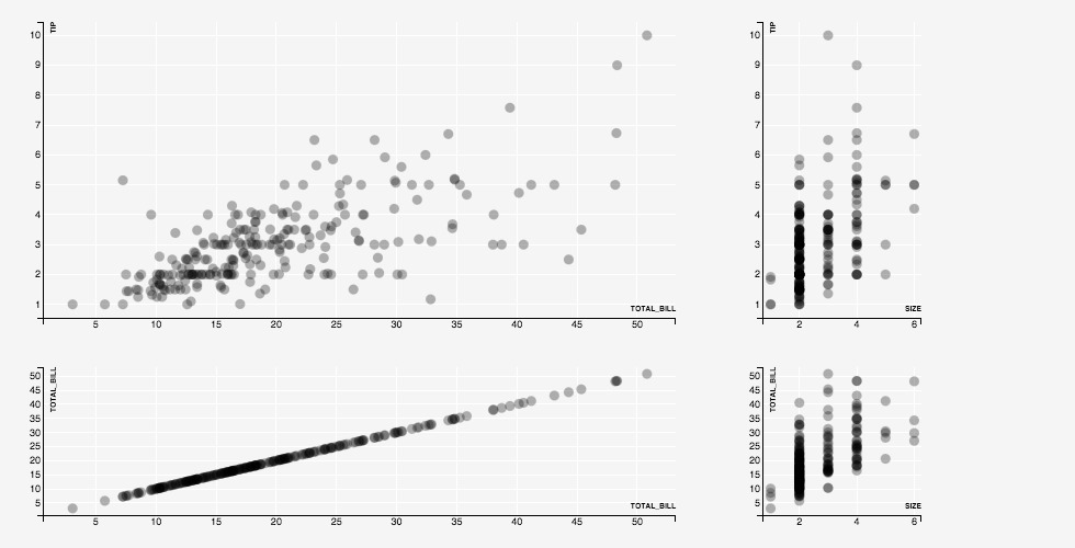
In ScleraViz, we can assign weights to axes. By default, all axes are assigned a weight of 1. Assigning a weight of, say 0.5, makes the size of an axis half of an axis with weight 1. Similarly, assigning a weight of 2.0 makes the size of an axis twice that of an axis with weight 1. The actual axis lengths are assigned respecting these relative size constrainst and the constraint that all the plots need to fit in the given width and height.
tips
PLOT(GEOM=POINT(x=total_bill, y=tip), ALPHA=0.3)
PLOT(GEOM=POINT(x=`size`, y=tip), ALPHA=0.3)
PLOT(GEOM=POINT(x=`size`, y=total_bill), ALPHA=0.3)
PLOT(GEOM=POINT(x=total_bill, y=total_bill), ALPHA=0.3)
AXIS `size`(WEIGHT=0.25, TICKS=3)
AXIS tip(WEIGHT=2)
LAYOUT ALIGNED
Cross Plots◄
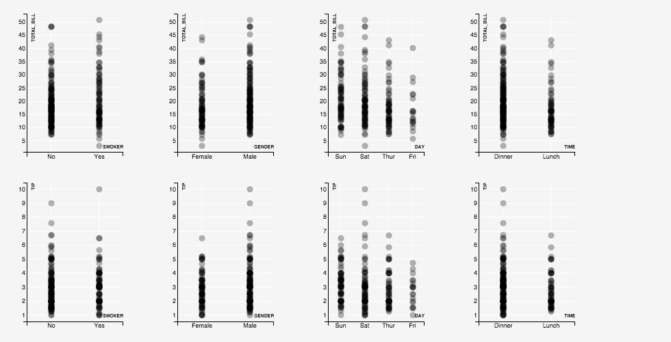
It is common to plot each of a set of columns against each of another set of columns. In ScleraViz, we can plot such "cross-plots" by using the single-layer PLOT syntax, and specifying a list of columns for the parameters of the geometry.
tips
PLOT(
  GEOM=POINT(x=(smoker, gender, day, `time`), y=(total_bill, tip)),
  ALPHA=0.3
)
LAYOUT ALIGNED
Faceted Plots◄
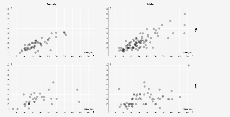
Faceting a plot on an expression involves displaying separate plots for datapoints partitioned by distinct values of the expression.
ScleraViz can facet along columns (meaning that the plots corresponding to distinct values are layed out horizontally, in separate columns in a grid), or have faceting along rows (meaning that the plots corresponding to distinct values are layed out vertically, in separate rows in a grid), or both.
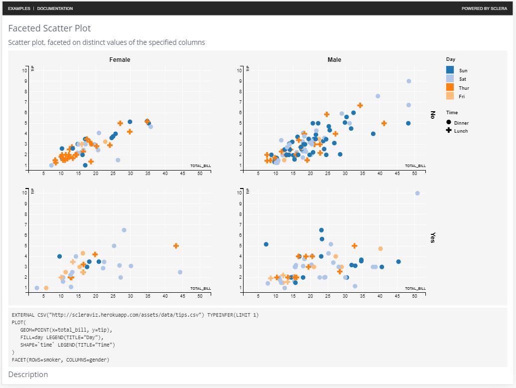
For instance, the following plot separates out the tip and total bill data based on whether smokers were present (yes/no, along rows), and the gender of the bill-payer (male/female, along columns):
tips
PLOT(GEOM=POINT(x=total_bill, y=tip), ALPHA=0.3)
FACET(ROWS=smoker, COLUMNS=gender)
Detailed Syntax◄
This section gives the detailed formal syntax of the ScleraViz specification language.
Formally, the ScleraViz specification is as follows (recall that | means alternatives, [] means optional, and ... means repetitions):
query plot_spec [ , ... ] [ facet_spec ] [ axis_spec ] [ ... ] [ layout_spec ] [ grid_spec ] [ display_spec ]
where the query is a ScleraSQL query. The plot specification plot_spec can appear one or more times, each plot_spec defining a new plot, followed by an optional facet specification facet_spec, zero or more axis_spec if we need to change the axis defaults. A layout_spec then gives the layout preferences. This is followed by a grid_spec if we need to change the grid defaults, and a display_spec to change the display area defaults.
Plot / Layer Specification◄
The plot_spec specifies a plot, and has two variants:
PLOT ( layer_params ) | PLOT ( LAYER ( layer_params ) [, ...] )
The first variant is an shortened form of the second, and can be used when the plot has only one layer. The second variant is needed when the plot has multiple layers.
Each layer_param specifies a layer in the plot. It contains several parts, each of them except geometry being optional, which can be specified in any order. We describe the sybtax of each part in the next few sections.
Geometry◄
The geometry specifies the manner in which the datapoint will be represented in the chart. The syntax is as follows:
GEOM = geom_type [ ( geom_params ) ]
The geom_type is the type of the geometry, and geom_params is a comma-separated list of key = value entries. The keys for each geometry are given the following table; the values for the keys can be a numeric scalar expression on the underlying table (or a constant).
geom_type |
geom_params keys |
|---|---|
| POINT or SCATTER | X, Y |
| LINE | X, Y |
| POINTRANGEY | X, Y, YMIN, YMAX |
| ERRORBAR or RANGEY | X, YMIN, YMAX, [WIDTH] |
| ERRORBARH or RANGEX | XMIN, XMAX, Y, [HEIGHT] |
| RIBBON | X, YMIN, YMAX |
| ABLINE | YINTERCEPT, SLOPE |
| HLINE | Y |
| VLINE | X |
| SEGMENT | X, XEND, Y, YEND |
| ARROW | X, XEND, Y, YEND |
| AREA | X, Y |
| RECT | XMIN, XMAX, YMIN, YMAX |
| HISTOGRAM or HIST | XMIN, XMAX, FREQ |
| BAR | X, Y |
| REGIONX | XMIN, XMAX, YMIN, YMAX |
| REGIONY | XMIN, XMAX, YMIN, YMAX |
| OHLC | TS, OPEN, HIGH, LOW, CLOSE, [WIDTH] |
| CANDLESTICK | TS, OPEN, HIGH, LOW, CLOSE, [WIDTH] |
In the above table, keys enclosed in [] are optional, others are required.
The geom_params are optional, and may only specify the values for a subset of the required keys for the geometry. When a required key needed by a geometry does not appear in the geom_params, it is mapped to a column of the same name in the input.
The GEOM specification itself is optional -- if omitted, it defauts to POINT, with the keys X and Y mapped to input columns of the same name.
Cross-Plots◄
In the single-layer variant, the geom_param keys can have a list of expressions instead of the single expression allowed above. This is considered a shortcut, and expands to a separate plot for each value in the list. If multiple geom_param keys have a list of expressions, then the specification expands to a separate plot for each combination of the geom_param values across these lists.
Apart from the geom_param values, each of the plots so generated have the directives and properies as specified in the rest of the PLOT specification.
Aesthetics, Scales, and Legends◄
The aesthetics directives change the default look (colors, shape, size, etc.) of the data points, and also assign legends. The syntax is as follows:
aes_key = aes_value [ SCALE = scale [ ( scale_params ) ] ] [ ON NULL null_aes_const ] [ LEGEND [ ( legend_params ) ] ]
The aes_key is an attribute such as FILL, STROKE, etc. (see the table below), and aes_value has the syntax:
aes_const | aes_expr | IDENTITY ( aes_identity_expr )
aes_constis a constant of the appropriate type as specified in the table below. For example,FILL = "red".aes_expris a scalar expression of the appropriate type as specified in the table below. A scale maps distinct values of this expression to the appropriate value for theaes_key. For instance, specifyingFILL = foomaps distinct values in the columnfooto distinct colors from a default palette. The palette can be explicitly specied using ascale(see below).aes_identity_expris an expression that evaluates to the literal value of an ordinal type. For instance, if a columnsfoocontains valid color names such as "red", "blue", "black", etc., then we can specifyIDENTITY(foo)as theaes_value.
Each geometry has an associated list of aes_key alternatives that it can interpret; aes_key specifications that are not associated with the specified geometry are ignored.
The keys aes_key, types of aes_value and associated geometries are listed in the table below.
aes_key |
Type | Geometry | Description |
|---|---|---|---|
SIZE |
Numeric | POINT, POINTRANGEY | Specifies the size of the point |
SHAPE |
Ordinal (valid shape values) | POINT, POINTRANGEY | Specifies the shape of the point |
FILL |
Ordinal (valid color values) | POINT, POINTRANGEY, AREA, BAR, RIBBON, OHLC | Color used to fill the shape |
ALPHA |
Numeric (between 0 and 1) | all geometries | Opacity of the rendering |
STROKE |
Ordinal (valid color values) | all geometries | Color used for the line |
STROKE-WIDTH |
Numeric | all geometries | Specifies the width of the line |
INTERPOLATE |
Ordinal (valid interpolate values) | LINE, AREA, RIBBON | Sets the path interpolation mode |
TENSION |
Numeric (between 0 and 1) | LINE, AREA, RIBBON | Sets the path tension |
Scale◄
Using a non-constant expression aes_expr for the aes_value makes the aesthetics a function of the data. The mapping from the distinct values of the expression (e.g. day of the week) to the aesthetics specification (e.g. colors "red", "blue", "green") is called a "scale".
The scale is numeric if it outputs numeric values; examples of numeric scales are: LINEAR, LOG, and SQRT. Further information on numeric scales, their defaults and capabilities appears in the D3 documentation.
The scale is ordinal if it outputs ordinal values; examples of ordinal scales are ORDINAL, COLOR, and SYMBOL.Further information on the ordinal scales, their defaults and capabilities appears in the D3 documentation.
To explicitly specify the scale, we specify the scale (LINEAR, LOG, SQRT, ORDINAL, COLOR or SYMBOL), and optionally, the associated parameters scale_params to override the defaults.
The following table lists the default scales for each aesthetics parameter:
aes_key |
Default Scale | Default Domain | Default Range |
|---|---|---|---|
SIZE |
LINEAR | [0, 1] | [0, 1] |
SHAPE |
SYMBOL | Dynamic | Symbol types supported in D3 |
FILL |
COLOR | Dynamic | Palette "category20c" |
ALPHA |
LINEAR | [0, 1] | [0, 1] |
STROKE |
COLOR | Dynamic | Palette "category20c" |
STROKE-WIDTH |
LINEAR | [0, 1] | [0.5, 2.5] |
A "dynamic" domain means that the domain is updated on the fly and consists of all the unique value for the associated expression seen so far.
The following lists the syntax of the parameters scale_params associated with the respective scales:
LINEAR ( DOMAIN = ( dom_min , dom_max ) , RANGE = ( range_min, range_max ) )- Explicit specification of domain and range
( dom_min, dom_max )and( range_min, range_max )are numeric intervals.
LINEAR ( dom_min, dom_max )- Explicit specification of only the domain, range at default [0, 1].
LOG ( DOMAIN = ( dom_min , dom_max ) , RANGE = ( range_min, range_max ) )- Explicit specification of domain and range.
( dom_min, dom_max )and( range_min, range_max )are numeric intervals.
LOG ( dom_min, dom_max )- Explicit specification of only the domain, range at default [0, 1].
SQRT ( DOMAIN = ( dom_min , dom_max ) , RANGE = ( range_min, range_max ) )- Explicit specification of domain and range.
( dom_min, dom_max )and( range_min, range_max )are numeric intervals.
SQRT ( dom_min, dom_max )- Explicit specification of only the domain, range at default [0, 1].
ORDINAL ( DOMAIN = ( dom_value [ , ... ] ) , RANGE = ( range_value [ , ... ] ) )- Explicit specification of domain and range.
dom_valueandrange_valueare ordinal.
ORDINAL ( range_value [ , ... ] )- Explicit specification of range.
- Domain is dynamic -- that is, updated on the fly and consists of all the unique value for the associated expression seen so far.
COLOR ( DOMAIN = ( dom_value [ , ... ] ) , RANGE = ( range_color [ , ... ] ) )- Explicit specification of domain and range.
dom_valueis ordinal.range_coloris a valid color name or specification.
COLOR ( range_color_palette )- Explicit specification of range as a palette.
range_color_paletteis color palette name supported by D3. It can be one of "category10", "category20", "category20b", or "category20c"- Domain is dynamic -- that is, updated on the fly and consists of all the unique value for the associated expression seen so far.
COLOR ( range_color , range_color [ , ... ] )- Explicit specification of range as a list of colors. At least two colors must be present.
range_coloris a valid color name or specification.- Domain is dynamic -- that is, updated on the fly and consists of all the unique value for the associated expression seen so far.
-
COLOR ( dom_value AS range_color [ , ... ] )- Explicit specification of domain and range as a mapping from values to colors.
dom_valueis ordinal.range_coloris a valid color name or specification.
-
SYMBOL ( DOMAIN = ( dom_value [ , ... ] ) , RANGE = ( range_symbol [ , ... ] ) )- Explicit specification of domain and range.
dom_valueis ordinal.range_symbolis a valid symbol name in D3.
SYMBOL ( range_symbol , [ , ... ] )- Explicit specification of range as a list of symbols.
range_symbolis a valid symbol name in D3.- Domain is dynamic -- that is, updated on the fly and consists of all the unique value for the associated expression seen so far.
SYMBOL ( dom_value AS range_symbol [ , ... ] )- Explicit specification of domain and range as a mapping from values to symbols.
dom_valueis ordinal.range_symbolis a valid symbol name in D3.
In the above, ORDINAL scale is a generalization of COLOR and SYMBOL, where range_value is constrained to colors and symbols respectively.
Handling NULLs◄
The scale maps the values to aesthetic specifications. By default, the NULLs are mapped to a default aesthetic specification, and are ignored in legends.
One way to map NULLs as aesthetic specifications is to replace them with an actial value using COALESCE(...) in the ScleraSQL query. This is not recommended as this changes the data for the sake of visualization.
A better alternative is to use the ON NULL modifier to specify the aesthetic specification (constant) to be used for NULLs (recall the syntax above). For instance, FILL = foo ON NULL "red" will colour all datapoints where column foo is NULL as red.
Legend◄
The mapping from the aesthetics specification (e.g. colors "red", "blue", "green") to distinct values of the expression (e.g. day of the week) -- that is, the inverse of the scale -- is documented as a legend.
To add a legend for an aes_key, add the keyword LEGEND after the specification (recall the syntax).
The LEGEND modifier takes an optional set of parameters, labeled legend_params in the syntax, and can include one or more of the following in a comma-separated list:
ORIENTATION = orientation_param- The
orientation_paramcan beVERTICALorHORIZONTALand defined the manner in which the legend will be rendered; the default isVERTICAL. - Since the allocated space for legends is at the right of the chart,
VERTICALorientation is a better fit, and is recommended.
- The
TITLE = title_string- Specifies the title of the legend. If omitted, the title is not rendered.
LABELS = ( label_string [ , ... ] )- Use the specified labels instead of the values provided by the associated scale mapping.
LABELS = ( value AS label_string [ , ... ] )- Specifies an explicit mapping of the labels to use instead of the values provided by the associated scale mapping.
Group◄
The optional GROUP expression groups data points; each group is then rendered separately. The syntax is:
GROUP = scalar_expr
where scalar_expr is a ScleraSQL scalar expression on the input.
Key◄
The optional KEY expression identifies a rendered data point (a point in a scatter-plot, a bar in a bar-chart, etc.). All input rows with the same value of the KEY expression map to the same rendered data point; the first such row creates the data point, and the subsequent rows modify the same.
The syntax is:
KEY = scalar_expr
where scalar_expr is a ScleraSQL scalar expression on the input.
If KEY is not specified, a new datapoint is created for each input row.
Position◄
The optional POSITION directive specifies how to reposition "colliding" data points -- that is, data points that are rendered one over the other as they have the same value of the relevant geom_param parameters (e.g. x expression, y expression, or both). The syntax is:
POSITION = { DODGE | STACK | JITTER } [ ( pos_params ) ]
POSITION = DODGE repositions the colliding data points one after the other, around the common x value; applied to a bar chart, this is a "grouped" bar chart.
POSITION = STACK repositions the colliding data points one over the other, at the common x value; applied to a bar chart, this is a "stacked" bar chart.
POSITION = JITTER repositions the colliding data points randomly around the common x and y value, spreading a set of colliding scatterplot points, for instance, randomly into a circular region.
The POSITION specification can also include pos_params that are passed as arguments to the renderer. The arguments are dependent on the associated geometry of the underlying data points, and have the form pos_key = pos_value as listed in the table below:
| POSITION | GEOM | Parameter | Value |
|---|---|---|---|
| DODGE | BAR | PADDING | Padding between bars |
| DODGE | BAR | OUTERPADDING | Padding at the start and end |
| STACK | BAR | PADDING | Paddding between bars |
| JITTER | POINT | x |
Maximum jitter along 'X' axis |
| JITTER | POINT | y |
Maximum jitter along 'Y' axis |
Stat◄
The STAT directive specifies a statistical operation over the input data points. The syntax is:
STAT = { LOESS | BIN | BIN2D } [ ( stat_params [ , aes_params ] ) ]
Applies on a scatter plot, i.e. GEOM = POINT(x = ..., y = ...), STAT = LOESS computes local regression smoothing, STAT = BIN computes density histograms over the x expression values, and STAT = BIN2D computes two-dimensional histograms (heat-maps) over the x and y expression values.
The result is a rendering in another layer. STAT = LOESS renders a line, STAT = BIN renders a histogram, and STAT = BIN2D renders a two-dimensional tiling representing the bins with an opacity proportional to the number of points covered under the bin.
The STAT specification also includes stat_params that are passed as arguments to the operation, and aes_params that override the default aesthetics parameters for the layer containing the rendered result.
The stat_params for each STAT type is listed in the table below:
| STAT | Parameter | Required / Optional | Description |
|---|---|---|---|
| LOESS | BANDWIDTH | Optional | When computing the loess fit at a particular point, this fraction of source points closest to the current point is taken into account for computing a least-squares regression. A sensible value is usually 0.25 to 0.5, the default value is 0.3. See Apache Commons Math Documentation |
| LOESS | ITERS | Optional | This many robustness iterations are done. A sensible value is usually 0 (just the initial fit without any robustness iterations) to 4, the default value is 2. See Apache Commons Math Documentation |
| LOESS | ACCURACY | Optional | If the median residual at a certain robustness iteration is less than this amount, no more iterations are done. If the median residual at a certain robustness iteration is less than this amount, no more iterations are done. See Apache Commons Math Documentation |
| LOESS | WEIGHT | Optional | Expression giving the coefficients by which the robustness weight of a point is multiplied. Default: 1. See Apache Commons Math Documentation |
| BIN | BINWIDTH | Required | Width of a histogram bin. |
| BIN | MIN | Optional | Minimum X-value. If omitted, is determined by pre-scanning the data |
| BIN2D | XBINWIDTH | Either this or BINWIDTH required | Width of a histogram bin |
| BIN2D | YBINWIDTH | Either this or BINWIDTH required | Height of a histogram bin |
| BIN2D | BINWIDTH | Required when either XBINWIDTH or YBINWIDTH omitted | Width / height of a histogram bin, used when XBINWIDTH and YBINWIDTH are equal |
| BIN2D | XMIN | Optional | Minimum X-value. If omitted, is determined by pre-scanning the data |
| BIN2D | YMIN | Optional | Minimum Y-value. If omitted, is determined by pre-scanning the data |
Mark◄
The MARK directive marks out regions where a specified predicate is true. The syntax is:
MARK { XAXIS | YAXIS } ( mark_predicate [ , aes_params [ , ... ] ] )
XAXIS refers to the marking along the X axis, and leads to vertical marked regions. Similarly, YAXIS refers to marking along the Y axis, and leads to horizontal marked regions.
The mark_predicate refers to the predicate (that is, boolean-values expression) on the input; the marked region includes exactly the points where this predicate evaluates to true.
The MARK specification also aes_params that override the default aesthetics parameters for the layer containing the marked regions.
Tooltip◄
We can attach a tooltip to each data point rendered, so that when a viewer hovers a mouse cursor over the data point, this tooltip is displayed.
The syntax is, simply:
TOOLTIP = tooltip_expr
Where tooltip is a string-valued expression. The tooltip message is generated by evaluating this expression over the row associated with the data point being hovered over.
Hiding the Layer◄
Stat and mark directives discussed earlier generate derivative layers by doing computation over the rows associated with data points in a given layer. After these derivative layers are generated, the default is to retain the original (base) layer.
This is not always desirable, especially if the derivative layer and the derived layer have different ranges of values. An example is a scatter-plot and its density (computed using STAT=BIN(...) -- both share the 'X-axis', but the Y-axis for the scatter-plot could be very different from the Y-axis for the histogram which displays the relevant counts of the points. Displaying both these together in the same plot is not feasible.
ScleraViz therefore enables hiding of the original (base) layer, by including the directive HIDDEN in the layer.
In the scatter-plot example, specifying HIDDEN in the scatterplot layer alongside STAT=BIN(...) hides the scatter-plot, and displays only the histogram.
Layer Display Order◄
Layers of a plot are overlayed one over the other. This makes it important to be able to explicitly specify the order in which the layers are rendered; this is done using the syntax:
DISPLAYORDER = display_order
where display_order is an arbitrary numeric value. This can be specified for the base layers as well as for the derived layers (those added as results of STAT and MARK operations).
At runtime, the renderer sorts the available layers on increasing display_order, and rennders the layers in the resulting order.
Facet◄
Faceting a plot on an expression involves displaying separate plots for datapoints partitioned by distinct values of the expression. ScleraViz allows faceting on a single expression, or a pair of expression; the resulting plots can be layed out in a row or columns or a row/column grid.
The syntax has the following alternatives (scalar_expr is a ScleraSQL scalar expression on the input):
FACET ( ROWS = scalar_expr )- Generates a plot for each distinct value of the given expression. The resulting plots are layed out in a row, their widths adjusted to fit the available total width.
FACET ( COLUMNS = scalar_expr )- Generates a plot for each distinct value of the given expression. The resulting plots are layed out in a column, their heights adjusted to fit the available total height.
FACET ( ROWS = scalar_expr, COLUMNS = scalar_expr )- Generates a plot for each distinct pair of values of the respective expressions. The resulting plots are layed out in a grid, in the row and column order according as specified, their widths and heights adjusted to fit the available total width and total height.
Axis◄
SclerViz identifies axes with expressions. Axes associated with the same expression across plots are actually renderings of the same internal representation; this keeps the axes renderings in sync as new data is received and the plots are updated.
The axis specification changes the default behaviour and appearance of an axis. The syntax is:
AXIS axis_expr ( axis_param [, ...] )
where axis_expr is the expression mapped by the axis in the plots, and axis_param can be:
LABEL ( label_string )- Assigns the label
label_stringto all renderings of the axis. If the axis withaxis_exprappears in two different plots, the label appears in both the axis renderings.
- Assigns the label
SCALE = { TIME | LINEAR | LOG | SQRT } [ ( min_value, max_value ) ]- Assigns a continuous scale to the axis. The scale maps the values of the
axis_exprto coordinates along the axis. - The optional interval
(min_value, max_value)explicitly specifies the min and max values for the axis. If not specified, the interval is computed dynamically, on the fly as data comes in. Either ofmin_valueandmax_valuecan beNULL, in which case it is considered unspecified, and is computed dynamically.
- Assigns a continuous scale to the axis. The scale maps the values of the
SCALE = ORDINAL- Assigns a scale to the axis. The scale maps the values of the
axis_expr, assumed discrete, to evenly placed coordinates along the axis.
- Assigns a scale to the axis. The scale maps the values of the
INCREASING = { TRUE | FALSE }- Declares whether the data is increasing along the axis. This extra knowledge of the input order helps speed up the computations while adjusting the scale when new data arrives.
WINDOW = window_size- The data points are displayed in a sliding window of size
window_size. The points are accumulated tillwindow_sizepoints are displayed, and then the plot slides as additional data arrives to display only the latestwindow_sizepoints.
- The data points are displayed in a sliding window of size
TICKFORMAT = format- Formats the tick labels. For
LINEAR,LOGandSQRTaxis types, theformatis specified in D3's format specification language. ForTIMEaxis, the alternative time format specification language is used instead.
- Formats the tick labels. For
TICKS = num_ticks- Sets a limit on the number of ticks displayed on this axis.
WEIGHT = axis_weight- Sets the size of this axis relative to other axes.
- By default, all axes are assigned a weight of 1. Assigning a weight of, say 0.5, makes the size of an axis half of an axis with weight 1. Similarly, assigning a weight of 2.0 makes the size of an axis twice that of an axis with weight 1.
- The actual axis lengths are assigned respecting these relative size constrainst and the constraint that all the plots need to fit in the given width and height.
Layout◄
When multiple plots are specified, the default layout is to display them in a column, with the heights adjusted to fit the total height.
The optional LAYOUT ALIGNED places the multiple plots so that the X-axes on the same expression and the Y-axes on the same expression are aligned in a column or row, respectively.
Grid Specification◄
Sets the aesthetics of the displayed grid and the axes. The syntax is:
GRID ( grid_param [ , ... ] )
where grid_param can be:
COLOR = color- Sets the background color.
coloris a valid color name or specification.- Default is "#F5F5F5"
axis_id( axis_aes [ , ... ] )axis_idisXAXISorYAXISXAXISsets the aesthetics for all theXaxes across all the plots.YAXISsets the aesthetics for all theYaxes across all the plots.
axis_aescan be:COLOR = color- Sets the color of the axis.
coloris a valid color name or specification.- Default is "#000"
TICKS = color- Sets the color of the ticks.
- Ticks are the vertical grid lines for
XAXIS, and the horizontal grid lines forYAXIS. coloris a valid color name or specification.- Default is "#FFF".
TICKS = noneremoves the ticks.
Display Specification◄
The display specification sets the dimensions of the plot and legend display areas. The syntax is:
DISPLAY ( display_param [ , ... ] )
where display_param can be:
WIDTH = width- Sets the width of the plot diplay area, in pixels.
- Default is 800 pixels.
HEIGHT = height- Sets the height of the plot diplay area, in pixels.
- Default is 450 pixels.
MARGIN ( margin_spec )- Sets the size of the four margins.
margin_speccan be:TOP = top_margin- Sets the top margin, in pixels.
- Default is 20 pixels.
RIGHT = right_margin- Sets the right margin, in pixels.
- Default is 20 pixels.
BOTTOM = bottom_margin- Sets the bottom margin, in pixels.
- Default is 30 pixels.
LEFT = left_margin- Sets the bottom margin, in pixels.
- Default is 40 pixels.
LEGEND ( legend_spec )- Sets the dimensions of the legend display area.
legend_speccan be:PADDING = legend_padding- Sets the padding between the plot and the legend, in pixels.
- Default is 20 pixels.
WIDTH = legend_width- Sets the width of the legend display area, in pixels.
- Default is 100 pixels.
Acknowledgements◄
ScleraViz is inspired by Grammar of Graphics, specifically R's ggplot2. The plots are rendered using D3, and the legends are rendered using D3-Legend.